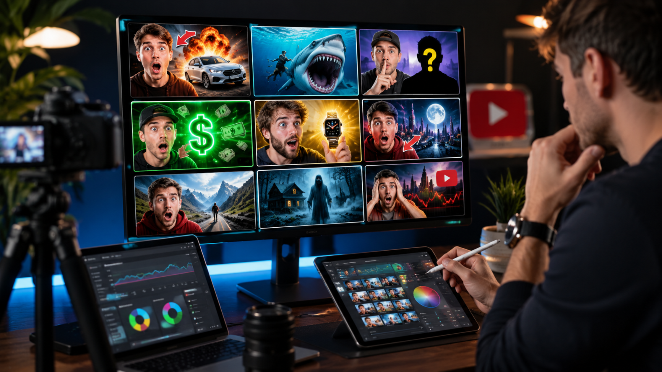
YouTube Thumbnail Psychology: How to Design Thumbnails That Get Clicked
Your thumbnail is the single most important creative decision you make for any YouTube video. Before a viewer hears a second of your audio or reads a word of your title, they have already made a sub-second judgement about whether your video is worth their time - based almost entirely on your thumbnail.
Click-through rate is one of YouTube's primary ranking signals. A thumbnail that compels viewers to click does not just get your video more views - it tells YouTube's algorithm that your content belongs in the recommendation feed, which multiplies your organic reach exponentially. This guide gives you the psychology and practical techniques behind thumbnails that consistently perform.
The Psychology Behind Thumbnail Decisions
Viewers do not consciously evaluate thumbnails. The decision to click or scroll happens in under 200 milliseconds - faster than conscious thought. What viewers are actually responding to are a small set of deeply-wired psychological triggers that experienced thumbnail designers use deliberately.
Pattern Interruption
The human visual system is designed to notice things that break the pattern of their surroundings. On a YouTube search results page or recommended feed, most thumbnails share similar colour palettes, composition styles, and visual hierarchies. A thumbnail that looks visually distinct from the surrounding content captures attention involuntarily - even before the viewer decides whether they are interested.
Emotional Contagion
Humans are wired to mirror the emotional expressions of faces they see. A thumbnail featuring an expressive, emotional face - surprise, excitement, disbelief, delight - subconsciously transmits that emotion to the viewer. This makes face-led thumbnails consistently outperform text-only or object-only thumbnails across almost every niche.
Curiosity Gaps
The most powerful thumbnails create an information gap - they show enough to make the viewer curious but not enough to satisfy that curiosity without clicking. A thumbnail showing a shocked reaction to something outside the frame, or the beginning of a transformation without the end result, creates a psychological pull that is difficult to scroll past.
Visual Simplicity
Thumbnails are viewed at small sizes - often 200 pixels wide or less on mobile. Complex, busy thumbnails with multiple elements competing for attention render as visual noise. The most effective thumbnails have one clear focal point: one face, one object, one bold word. Viewers' eyes need to know instantly where to look.
Practical Thumbnail Design Principles
Use High Contrast Colour Combinations
Complementary colour pairs - blue and orange, red and cyan, yellow and purple - create maximum visual contrast, making thumbnails pop off the page. Avoid colours that blend with YouTube's white and dark-mode backgrounds (white, light grey, very dark grey). Bright, saturated colours consistently outperform muted palettes in click-through rate testing.
Make Text Readable at Small Sizes
If you use text on your thumbnail, keep it to three to five words maximum, use a thick sans-serif font, and add a strong text outline or shadow to ensure readability against any background. Test your thumbnail at 20% of its actual size - if you cannot read the text easily, neither can a viewer scrolling on a phone.
Follow the Rule of Thirds
Place your primary subject - face, object, or text - in one of the four intersection points of a 3x3 grid overlaid on your thumbnail. These positions are naturally where viewers' eyes move first. Centred compositions feel static and less compelling than subjects positioned at grid intersections.
Create Thumbnail Series Consistency
Channels with strong visual branding - consistent colour palettes, font choices, and compositional styles - benefit from viewer recognition. When a subscriber who has clicked your videos before sees a familiar thumbnail style in their feed, the click decision is almost automatic. Invest time in defining a thumbnail template you can apply consistently.
Test and Iterate
YouTube Studio allows you to swap thumbnails after publication. If a video is underperforming on click-through rate, try a different thumbnail. Many creators run informal A/B tests by monitoring CTR for several days after a thumbnail change. The difference between a 4% CTR and an 8% CTR on the same video can double your total view count.
How Thumbnail CTR Connects to Channel Growth
Click-through rate does not exist in isolation. When YouTube sees that viewers are consistently choosing your videos over others in the same recommendation feed, it expands your content's distribution. This creates a virtuous cycle: better thumbnails lead to higher CTR, which leads to wider distribution, which leads to more subscribers, which leads to more immediate views on future videos - which further reinforces algorithmic distribution.
Building a subscriber base that gives your videos immediate early traction is part of this equation. Free YouTube Subscribers help new channels establish the baseline audience needed to generate meaningful early view signals. Combined with high-CTR thumbnails, the result is faster algorithmic traction than either strategy achieves alone.
Free Resources to Support Your Growth
Strong thumbnails bring viewers in - but you still need an audience to show them to. Free TikTok Followers and Free TikTok Likes help you build a TikTok presence that funnels viewers across to your YouTube channel - a cross-platform strategy that consistently outperforms single-platform growth. TikTok's short-form content naturally teases YouTube's long-form, making the two platforms an ideal combination.
For creators building an audience in Australia, our SMM Panel Australia offers YouTube packages with locally sourced engagement - helping your content rank higher in Australian search results and recommendation feeds where regional relevance is a meaningful ranking factor.
Conclusion
Thumbnails are the first and most important marketing decision for every YouTube video. The creators who consistently dominate their niches are almost always the ones who have mastered thumbnail psychology - using pattern interruption, emotional faces, curiosity gaps, and visual simplicity to make clicking feel inevitable.
Invest time in your thumbnails the same way you invest time in your scripts and editing. Test regularly. Iterate on what works. And combine strong thumbnail design with a growing subscriber base and cross-platform promotion to maximise the reach every video deserves.
1. What is a good click-through rate for YouTube thumbnails?
YouTube considers a CTR of 2–10% normal, with most established channels landing between 4–6%. A CTR above 6% is strong and indicates your thumbnails are performing well against competing content. New channels with small audiences often see higher CTRs because their subscribers are highly engaged fans - this typically normalises as the audience grows and more impressions go to cold audiences.
2. Should I always put a face on my thumbnail?
Faces outperform non-face thumbnails in most niches because of emotional contagion - viewers subconsciously mirror the emotion they see. However, niches like cooking, tech, gaming, and tutorial content can perform equally well with product or screen-focused thumbnails. Test both approaches for your specific niche. If you choose to use faces, ensure they show strong, clear emotion rather than neutral expressions, which perform no better than object-only thumbnails.
3. What size and resolution should my YouTube thumbnail be?
YouTube recommends 1280 x 720 pixels at a minimum resolution of 72 DPI, saved as JPG or PNG under 2MB. The aspect ratio is 16:9. Always design at 1280 x 720 or higher - upscaling a small image to thumbnail size produces visible pixelation that makes your content look low-quality and reduces click-through rate.
4. How often should I update old thumbnails?
Review the thumbnails of any video underperforming its impression count - specifically those with CTR below 3%. Old thumbnails on high-impression videos are the highest-leverage update you can make, since small CTR improvements on videos with large impression volumes generate significant additional views. Set a monthly audit to check your top 10 videos by impression count and test new thumbnails on the underperformers.
5. Does thumbnail text help or hurt click-through rate?
Text on thumbnails helps when it adds information the title does not already convey, creating a stronger curiosity gap or value proposition. It hurts when it simply repeats the title, crowds the visual, or is too small to read at thumbnail size. The best performing text thumbnails use 3–5 large bold words that complement rather than duplicate the video title. If your title is already strong and self-explanatory, a purely visual thumbnail often outperforms one with added text.
6. Can a better thumbnail help an old video that stopped getting views?
Yes - this is one of the most underused tactics on YouTube. When you change a thumbnail on an existing video, YouTube re-evaluates the video's CTR with the new creative. If the new thumbnail performs better, YouTube's algorithm may re-enter the video into recommendation feeds it had stopped circulating in. Many creators have revived videos that were dormant for months simply by testing a stronger thumbnail, generating fresh watch hours without publishing new content.